
How Wireless Network Coverage Maps Work—and Where They Fall Short
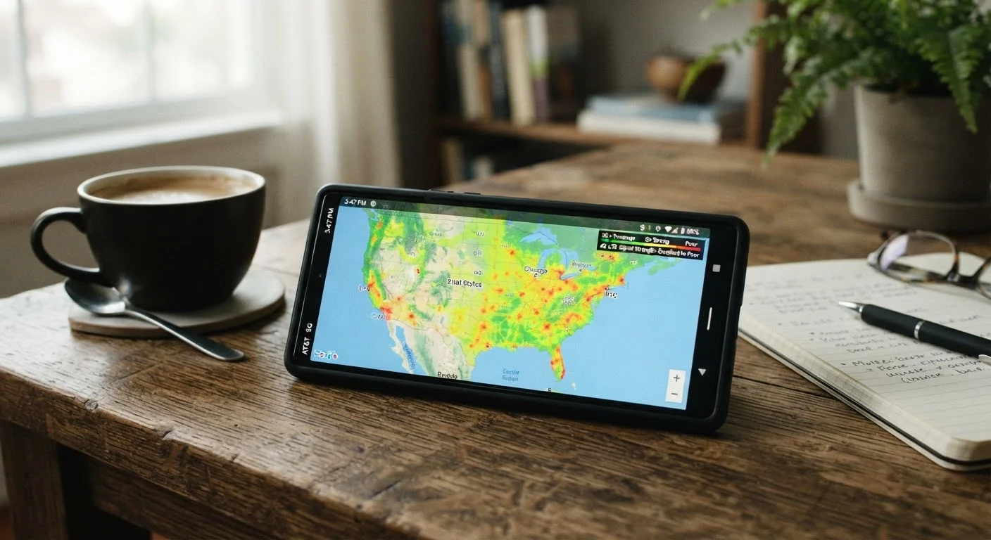
Photo credit: ArticlesHaven.net
In this article
Coverage maps look impressive, but they don't always reflect real-world signal. Learn to read them critically before switching carriers.
Key Takeaways
- Coverage maps use predictive models, not real-time data, so they show estimated signal availability.
- Indoor coverage, terrain, and building materials can degrade or eliminate signal in areas shown as covered.
- Different map layers (voice, LTE, 5G) represent very different quality levels and should be read separately.
- Third-party crowd-sourced data often reflects real-world performance more accurately than carrier maps.
- Testing service at your specific locations before committing to a plan is the most reliable method.
How Coverage Maps Are Built
Wireless carriers generate their coverage maps using radio frequency propagation models-software that estimates how far a signal travels from each tower given its power, height, and antenna orientation. The models factor in general terrain data like hills and valleys, but they do so at a broad scale.
The result is a map that looks authoritative and precise but is, in practice, an educated prediction. Carriers are not measuring signal at every address; they're computing where signal is likely to reach based on physics and tower data. This distinction matters enormously when you're trying to figure out whether you'll actually get service at your home, office, or regular commute route.
~20%
Gap between predicted and verified coverage
Independent network analysis has found meaningful discrepancies between carrier-reported coverage and coverage confirmed through drive and walk tests in the same areas.
50-90%
Signal loss through building materials
Research on radio frequency penetration shows that materials like concrete and metal can reduce signal strength by 50% to over 90% compared to outdoor readings.
Because the underlying models favor outdoor, unobstructed reception, the maps often reflect ideal conditions-think standing in an open field with clear line-of-sight to a tower. Real environments are rarely that simple.
What Coverage Maps Can't Show You
Even well-built coverage models hit hard limits. Here are the most common gaps:
- Indoor penetration: Concrete, brick, and metal significantly reduce signal strength. A location shown as fully covered may have weak or no signal indoors.
- Terrain micro-variation: A ridge, a cluster of buildings, or even a dense tree line can block signal that a broad model predicts will pass through.
- Network congestion: Maps show coverage-the presence of a signal-not capacity. During peak hours, a covered area can have slow, frustrating data speeds because the tower is overloaded.
- Roaming vs. native coverage: Some maps shade roaming zones the same color as owned-network zones. Roaming often comes with speed restrictions or data limits depending on your plan.
Understanding these blind spots helps explain why two neighbors on the same street can have completely different experiences with the same carrier. For more on how to look past carrier marketing, see evaluating real-world network quality.
Test Before You Commit
If a carrier offers a free trial or a no-commitment trial SIM, use it at the locations that matter most to you-home, work, and your regular commute. No map substitutes for a real-world test in your specific environment. Even a few days of firsthand use will tell you more than any coverage visualization.
Reading the Map Layers: Voice, LTE, and 5G
Most major carrier maps let you toggle between network types-typically voice, 4G LTE, and 5G. These layers represent very different service levels, and conflating them is a common mistake.
A shaded 5G area may be using sub-6GHz spectrum, which travels farther but delivers modest speed improvements over LTE. Or it could be mmWave 5G, which offers high speeds over very short distances and struggles to penetrate buildings. The map often uses the same color for both. Understanding the difference between nationwide and mmWave 5G is essential before reading any 5G coverage layer.
Similarly, voice coverage often extends well beyond LTE data coverage-so a fully shaded area on the voice map might have spotty or no 4G data service. Always check the data layer specifically if internet access is your priority.
Roaming Coverage Often Looks the Same
Many carrier maps shade roaming zones with the same color or similar shading as native-network coverage. On some plans, roaming data is deprioritized or capped well below native-network limits. Always check the map legend and read your plan's roaming terms to understand what kind of coverage you're actually looking at.
Better Tools and Smarter Verification
Carrier maps are a reasonable starting point, but they shouldn't be your only source. Several alternatives provide more grounded information:
- Crowd-sourced network tools: Independent platforms collect speed test and signal data from actual users, giving you a ground-level picture of performance in specific neighborhoods and buildings.
- Trial periods and temporary SIMs: Some carriers offer short-term trials. If yours doesn't, ask about their return policy before committing.
- Local knowledge: People who live and work in your area-especially those who travel the same routes-are often the most reliable source of coverage insight.
If you're in a rural area, the limitations of coverage maps are even more pronounced. Rural wireless coverage works differently, and your ZIP code can significantly narrow your real options regardless of what a map suggests.
Before you make any final decision, it's also worth running through a broader checklist. What to check before committing to a new phone plan covers coverage alongside data caps, roaming terms, and device compatibility. And if you're mid-switch, common mistakes when switching carriers are worth reviewing so coverage map misreads don't cost you.
Frequently Asked Questions

Author
Articles Haven Editorial Contributor
Articles Haven Editorial Team is the collective byline for our editorial team and contributor network. Articles published under this byline or an editorial pen name are researched, written, and reviewed according to our editorial standards for clarity, consistency, and independence before publication.
View all articles →